How it works

The method, in full.

No mystery and no black box. This is exactly how a set gets made, why it's built this way, and where a human decides.

Step one

Brief in a conversation, not a form.

Every client has a running thread. You ask for a set the way you'd ask a designer — "six angles for the $89 offer, two price-led, two social proof, two seasonal" — and refine in the same thread: make the third one warmer, phone number bigger, try it at 9:16.

Why a thread

Because a revision needs the previous version in context. The engine still has the set it just built and the actual files in front of it, so "warmer" edits that file instead of starting over and losing what was already right.

What comes back

Finished assets, inline, at the exact dimensions each placement needs — plus a note on which angles were chosen and why, and a flag on anything we couldn't verify.

Step two

Plate first. Type second.

This is the rule that separates creative you can run from creative that looks generated.

1

A photoreal plate with no text in it

Generated (or, better, the client's real photography) at the ratio we're shipping, composed with deliberate negative space where the copy will sit. We never ask an image model for a headline, a price or a phone number — image models mangle small text in a way that looks acceptable as a thumbnail and is obviously broken at full size.

2

Real type, laid over it

Headline, offer, badges, CTA and contact details are set as actual text with a gradient scrim underneath so they stay legible on busy photography. Every number is one you gave us.

3

Rendered to exact pixels, then checked

Screenshotted at 1080×1350, 1080×1920 or whatever the placement wants — and the dimensions are verified rather than assumed.

4

Video follows the same shape

Plan the beats, generate clean footage with nothing written on it, then burn captions, the offer reveal and the end card ourselves. A shot can be seeded from a still so the video and the static set look like the same campaign.

The method, visible

Same creative, two stages.

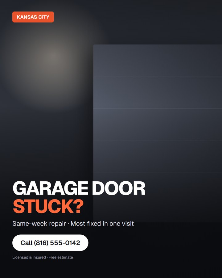
Left is the plate as it comes out of generation — photoreal, and deliberately empty where the copy is going. Right is the finished creative after the type layer is composed over it and rendered to exact pixels. Nothing on the right was drawn by an image model.

The generated plate: photoreal, no text, empty space lower-left
1 · PlateNo text anywhere. Light from the left, subject mass right, the lower-left kept clear on purpose.
The finished creative with headline, offer and CTA composed over the plate
2 · Composed & renderedHeadline, badge, CTA and contact set as real type over a scrim. Exactly 1080×1350.

Both images above were produced by the same renderer that makes our client work — this is the pipeline, not a mockup of it.
Ratios

One set, every placement.

The same composition is re-rendered at each size rather than cropped, so nothing important falls outside the frame and the type never ends up half off the edge.

4:51080×1350 · feed
9:161080×1920 · stories & reels
1:11080×1080 · square
16:91920×1080 · in-stream
Step three

Then the account tells us who was right.

Creative opinions are cheap. Delivery isn't.

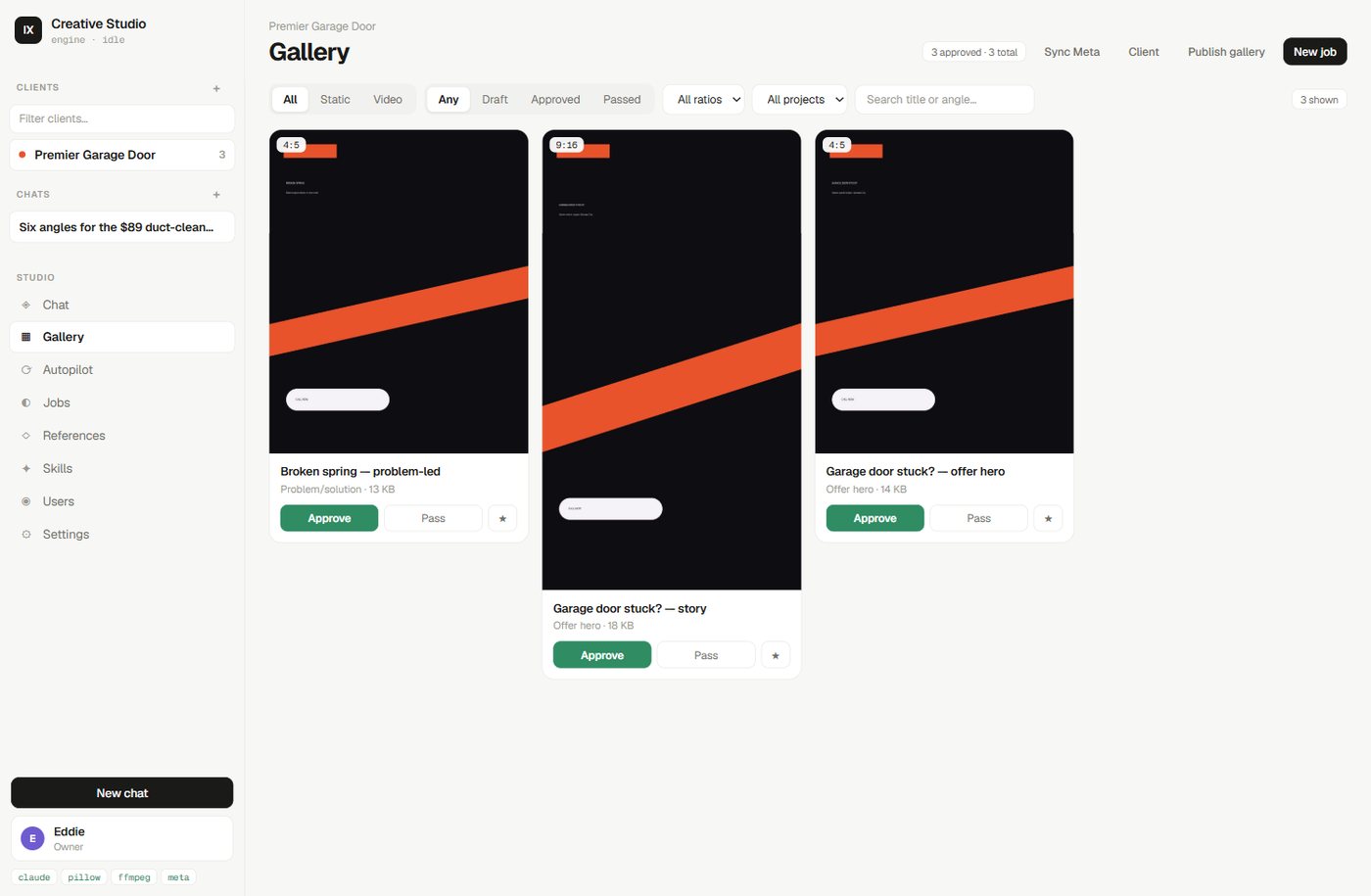
The gallery, showing each creative's spend, results and cost per result

Winners carry a green rail and their real numbers. Filters cut the library to winners, losers, ratio or location.

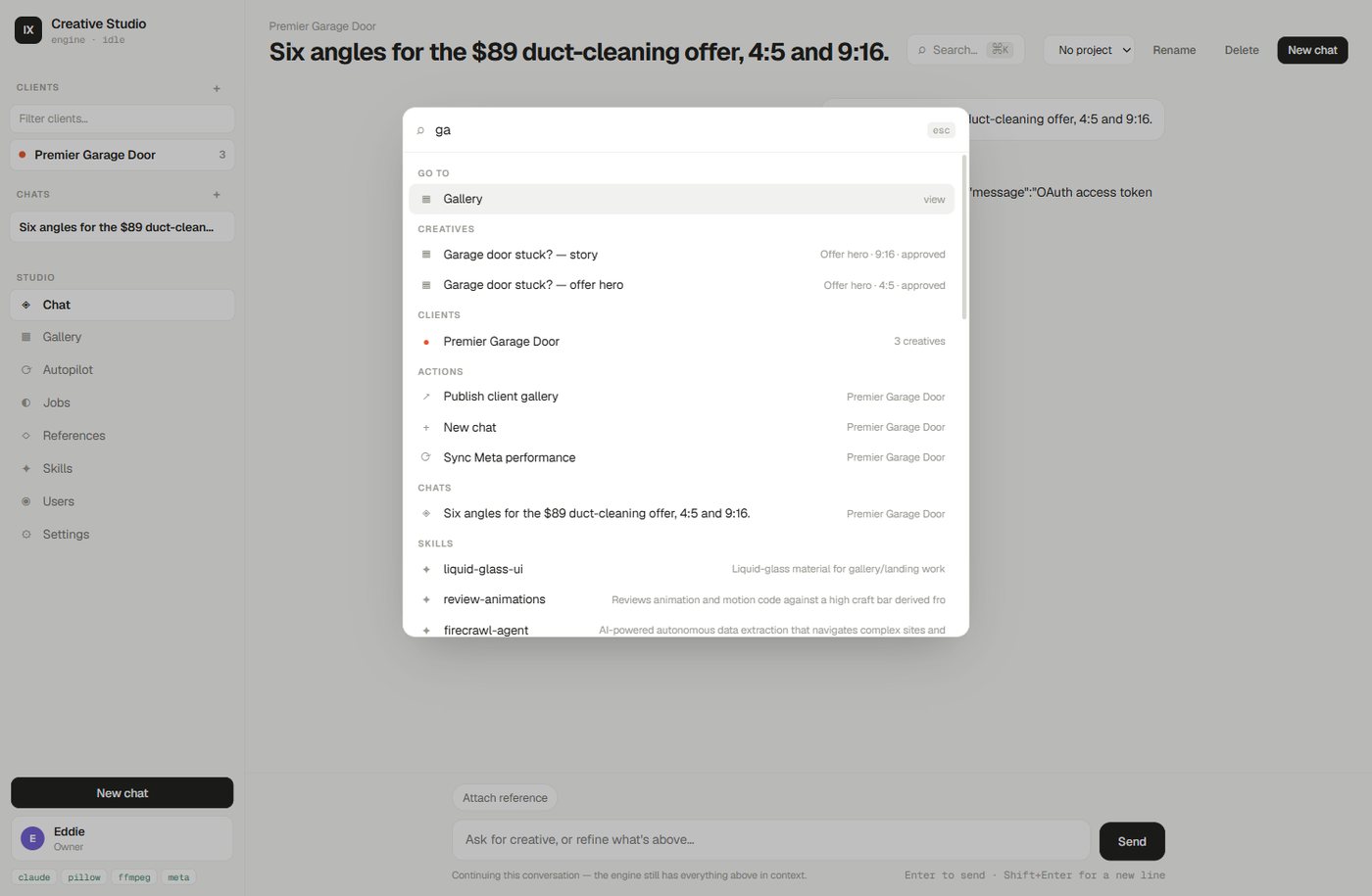
Search across clients, chats, creatives and skills

One search across every client, chat, creative and setting.

$

Cost per result, not CTR

Creatives are graded on what they actually bought — purchases, then leads, then bookings — because a library optimised for clicks becomes engaging ads that sell nothing.

Two windows, not one

The last week is compared against a 30-day baseline. One window shows what's winning; two show what's decaying — the creative at $30 a lead that quietly drifted to $55.

A spend floor before judging

Nothing gets called a loser on $6 of delivery. Below the floor it reads "not enough data", because a wrong verdict poisons every brief that follows it.

Multi-location

One city's win becomes another city's test.

Fatigue is measured per ad account, so locations are judged separately — pooling them hides the truth in both. But a winning argument transfers. When financing beats price in Miami, Tampa tests it localised instead of paying to rediscover it.

Locations inherit the brand's logo, palette and rules automatically. Only what actually differs — city, phone, service area, offer — is set per location.

What transfers, and what doesn't

AngleTransfers. The argument is portable.
ArtworkDoesn't. Rebuilt for the local city and proof.
FatigueNever pooled. Measured per account.
LosersNever transfer anywhere.
Where humans decide

Automation proposes. A person ships.

The refresh can run on a schedule, but nothing reaches an ad account on its own.

Everything arrives as a draft

New creative lands in the gallery for review. Approving is a person's click, and pushing to Meta creates paused drafts you enable yourself in Ads Manager.

Unverified claims get flagged

No invented review counts, licence numbers, awards or fake scarcity. If proof is missing we use an honest alternative and tell you what we couldn't verify.

Want it run on your account?

Send the offer and what's gone stale. We'll tell you what we'd test first.